The opening of the Balloon Museum exhibition in Brussels marked a significant rebranding of the brand's visual communication. The new identity features a more minimalistic design and the almost exclusive use of the Helvetica font. For the EmotionAir exhibition, yellow has been chosen as the dominant color, serving as a distinctive and central element across most of the communication.
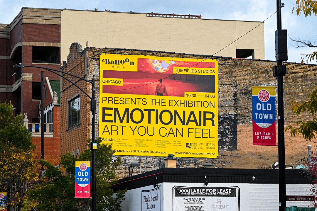
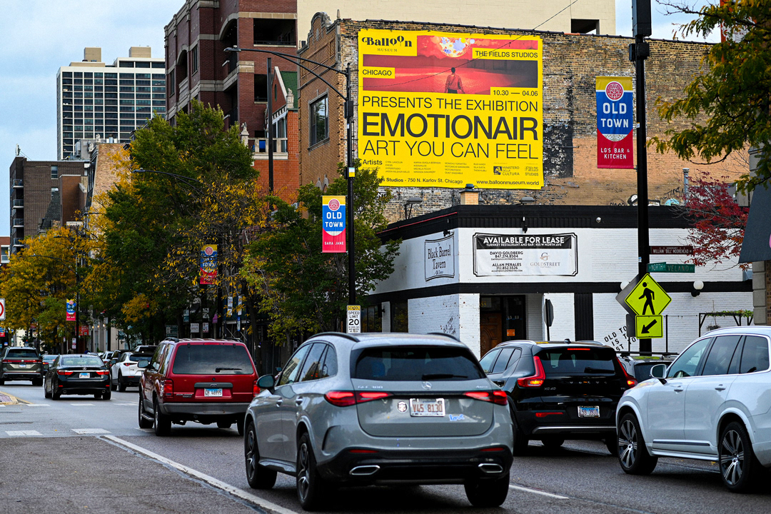
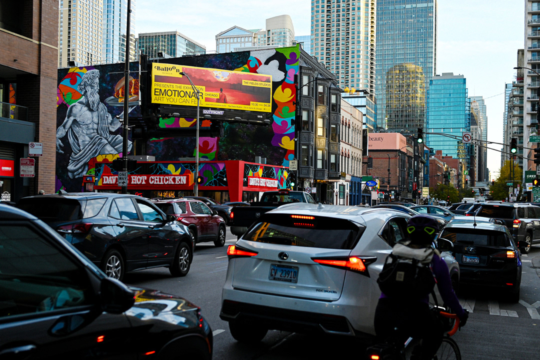
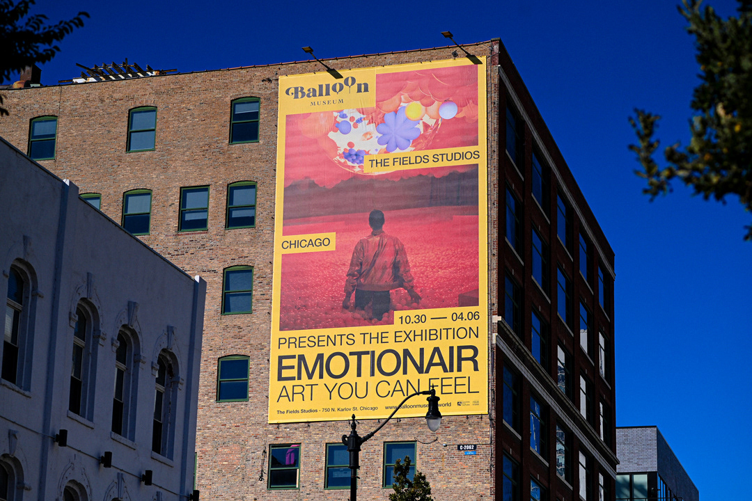
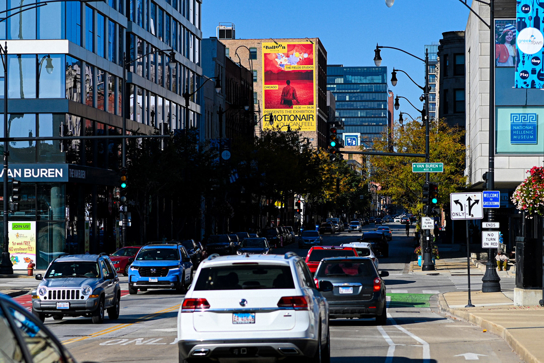
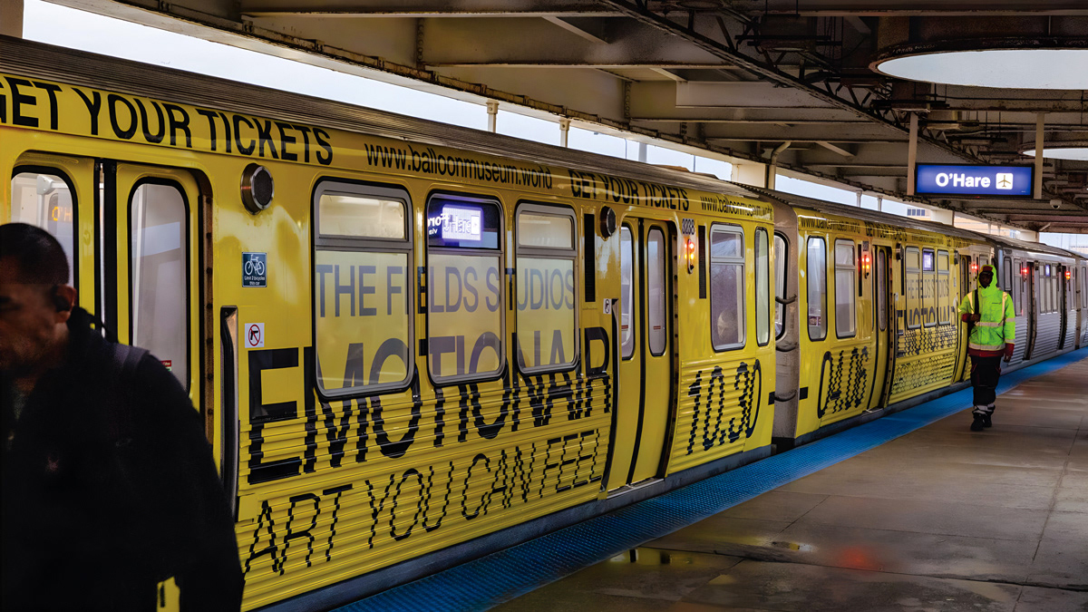
For OOH campaigns, I also worked on the branding of specific vehicles, which led me to work with media and technical specifications that were different from the usual.
A key feature of this exhibition is the branding of the building, which is closely tied to the visual identity of the event. The color yellow, the undisputed protagonist, stands out boldly against the gray tones of the structure, creating a unique visual impact. The graphics, applied to the windows of the façade, were designed across multiple modules to fit the existing architecture. Their impressive scale makes them visible from great distances, a particularly striking effect during the winter months of the exhibition, where the visual contrast becomes even more powerful and effective.
3D simulation of the various graphics applied to the structure
Timeline
Among the various graphics produced, one that stands out is the large-scale infographic of the Timeline. It was designed to ensure easy readability for the viewer, with a structure that accommodates the specific needs of the exhibition. Since the event took place in Belgium, the infographic was created to be fully accessible in the country’s two official languages (French and Dutch), as well as in English. This multilingual approach guarantees that all visitors can engage with the content, regardless of their language.
result after the installation
Detail of the image treatment, resulting from a completely vector-based photo manipulation.
